

Designing a Defence Against Phone Scams
MY Role
Product Design Lead
TEAM
Product Design Team
Bank security department
stakeholder
One of the largest banks in Russia
Description
Project to develop features for a banking mobile app that help customers protect themselves from phone fraud
KEY Results
Features for protection against phone fraud:
Suspension of suspicious payments
Approval of large and/or suspicious payments by a trusted person
Fraud-detecting call bot

Context
Phone fraud in Russia is a real national crisis.
The relevance and severity of the issue are illustrated by striking statistics that worsen each year:

Challenge
The project's stakeholder is one of the largest banks in Russia. Thousands of its clients face scammers every day, fall victim to them, and turn to the bank for help.
The bank's security team communicates with the victims daily, actively cooperates with the police in investigating crimes, and makes every effort to improve clients' cyber literacy to help them resist scammers.
However, the number of fraud cases is not decreasing, so the bank reached out to us for help and asked us to think of new ways to protect its clients and reduce the number of successful scams.
Research
Phase 1 — Fraud: Tactics and Targets
I did extensive work with statistics and studied over 30 articles, research papers, and information sources on fraud in the banking sector.
I found that 89% of fraud cases involve social engineering (psychological manipulation to control a person).
That's why we decided to dive deeper into the psychology behind it — to understand exactly how the scam works and why people believe the scammers.

Stage 2 — Why Do People Trust Scammers and How Can We Help Them?
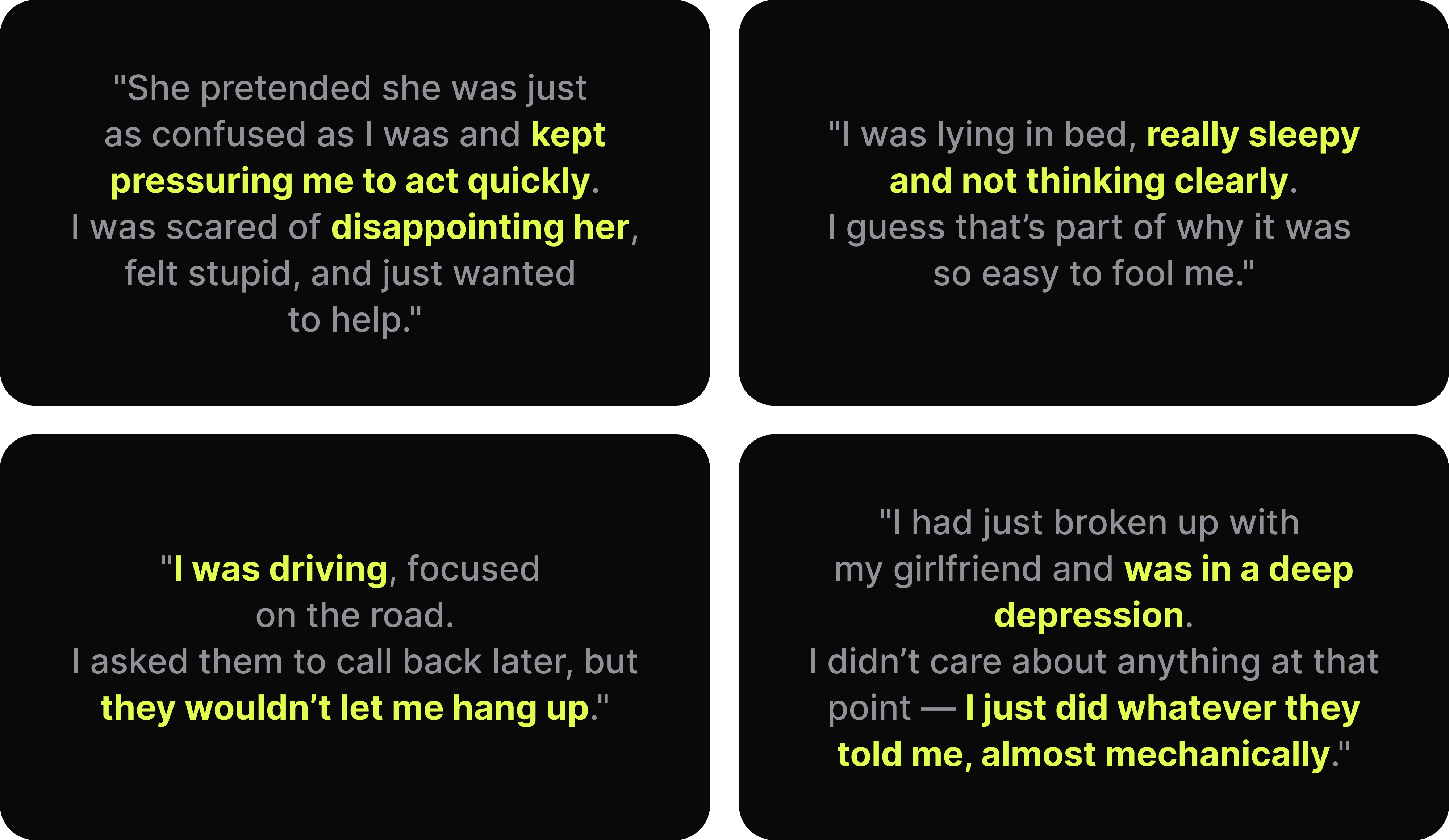
We conducted 18 very complex interviews with victims of phone fraud to understand the specific circumstances in which the fraud occurred. It turned out that during the scam, people lose their critical thinking, and this does not depend on gender, age, social status, or even their level of cybersecurity awareness.
I also had several consultations with psychologists and psychotherapists to understand why critical thinking declines in high-stress situations, what other factors influence it, and whether it can be prevented. In addition, I reviewed more than 25 academic articles on human psychology and victim psychology.
It turned out that four main types of factors contribute to the decline in critical thinking:
Physiological causes — age-related or other changes (e.g., hormonal), affecting cognitive abilities and human behaviour
Psychological traits — reactions to fear, anxiety, or other stressors, as well as general emotional state
Lack of attention in the moment — being focused on something else, distractions in the environment, or pressure to act quickly
Scammer’s professionalism — he credibility of the story, acting skills, and a trustworthy status (e.g., “bank employee” or “law enforcement officer”)
We also consulted with bank security staff to understand the technical side of how banks operate after a fraud has occurred — where victims turn for help and what the bank can actually do to support them.
It turned out that the bank usually just registers the case, but cannot help — the operation completed in favour of the scammer cannot be reversed, even if the victim contacts the bank within minutes of losing the money.
The detection rate for such crimes is very low — only 23%.
Key Findings

Product Goals
If the moment of the scam is hard to realise, then our product’s goal is to detect a suspicious transfer and alert or prevent it.
If money transfers to scammers cannot be reversed, then our goal is to pause the transfer and give the person a chance to cancel it.
Designing the Product
CJM
I created a very simple Customer Journey Map of the victim to identify the key stage where we should focus our attention.
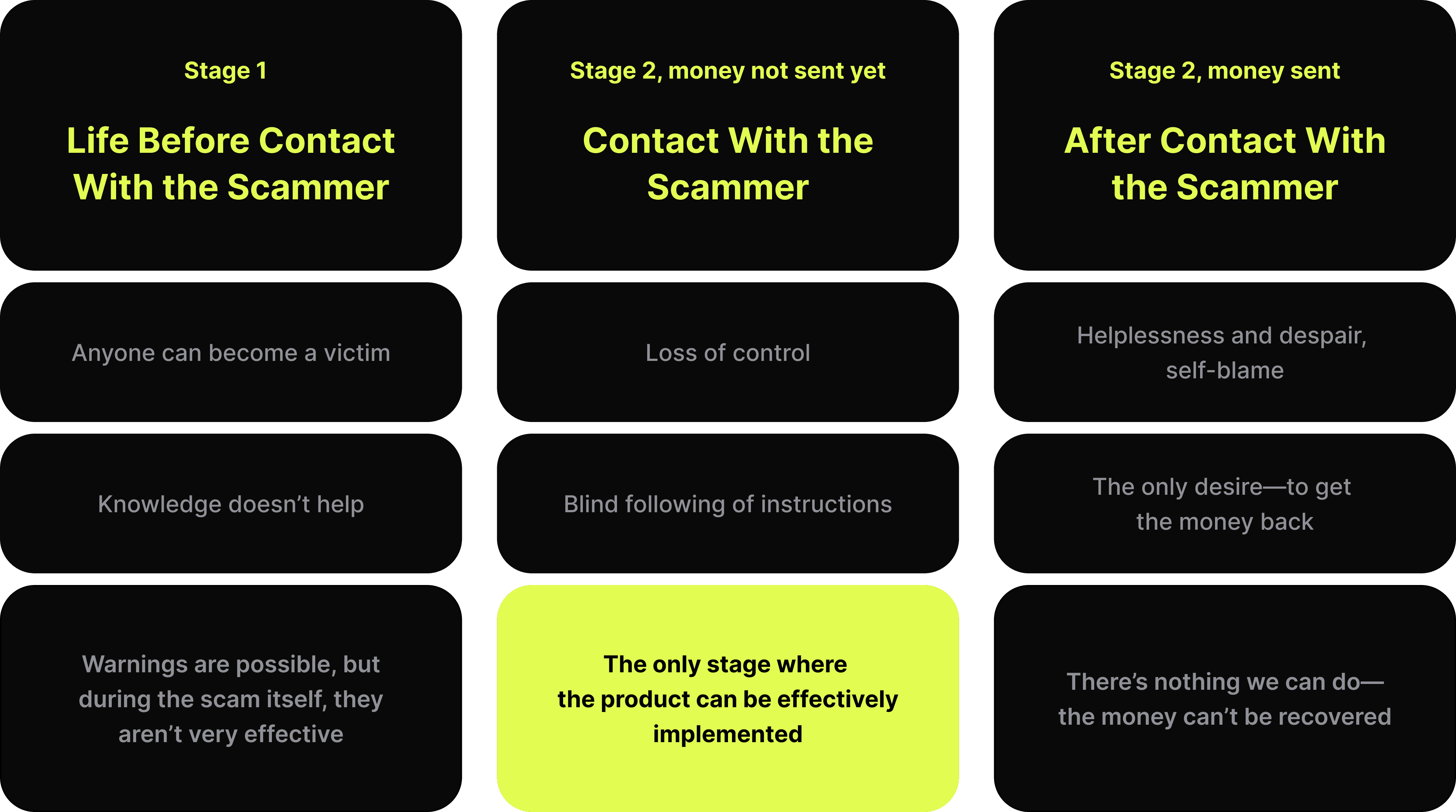
We can tell a person about scams and how they work, but in a critical situation, their cognitive functions may drop — and they might forget everything.
We can’t help if the money has already been sent.
But during the call, while the money hasn’t been transferred yet — we still have a chance!
Standard Phone Scam User Flow
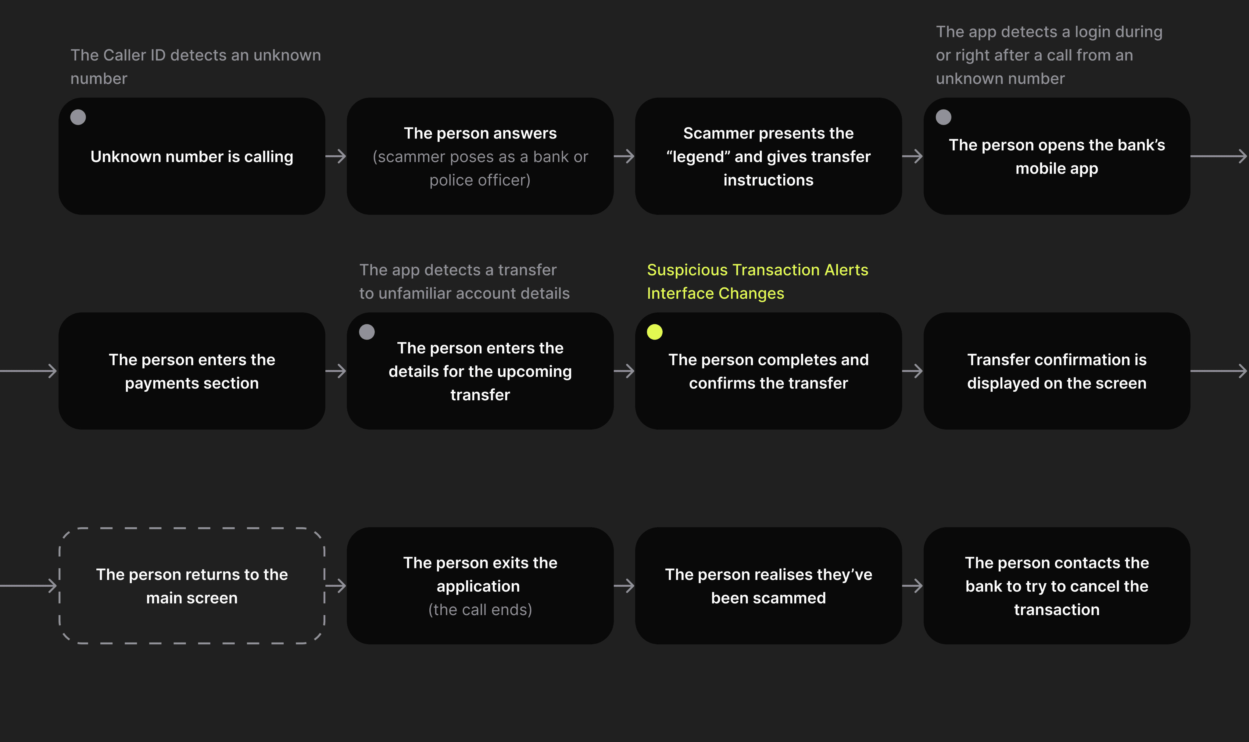
I created a user flow of a typical scam scenario to analyse each step and identify the points where our product can be most effective.

Looking at the resulting user flow, I came up with three key questions:
How can we detect that a scam is happening?
How can we warn the person and snap them out of it?
Is there anything we can do if we fail to stop the money transfer?
How can we detect that a scam is happening?
There are three triggers that, when they happen one after another, strongly suggest that the person is talking to a scammer:
A call comes in from an unknown number
During or right after the call, the person opens their banking app
The person makes a transfer to unfamiliar account details

How can we warn the person and snap them out of it?
After the third trigger is activated, we must do everything we can to warn the person that something suspicious is happening and that they might be talking to a scammer.
Is there anything we can do if we fail to stop the money transfer?
If the person still goes through with the transfer, we need to buy time — so they can snap out of it and realise what just happened.
We can pause the transaction and give them the option to cancel it.

First Interfaces & User Testing
It's impossible to fully recreate the situation in which our product would actually be used — during testing, the person knows they're safe and can't reach the same emotional state they would be in during a real scam.
Still, we ran a series of tests and, despite the limitations, got some interesting results.
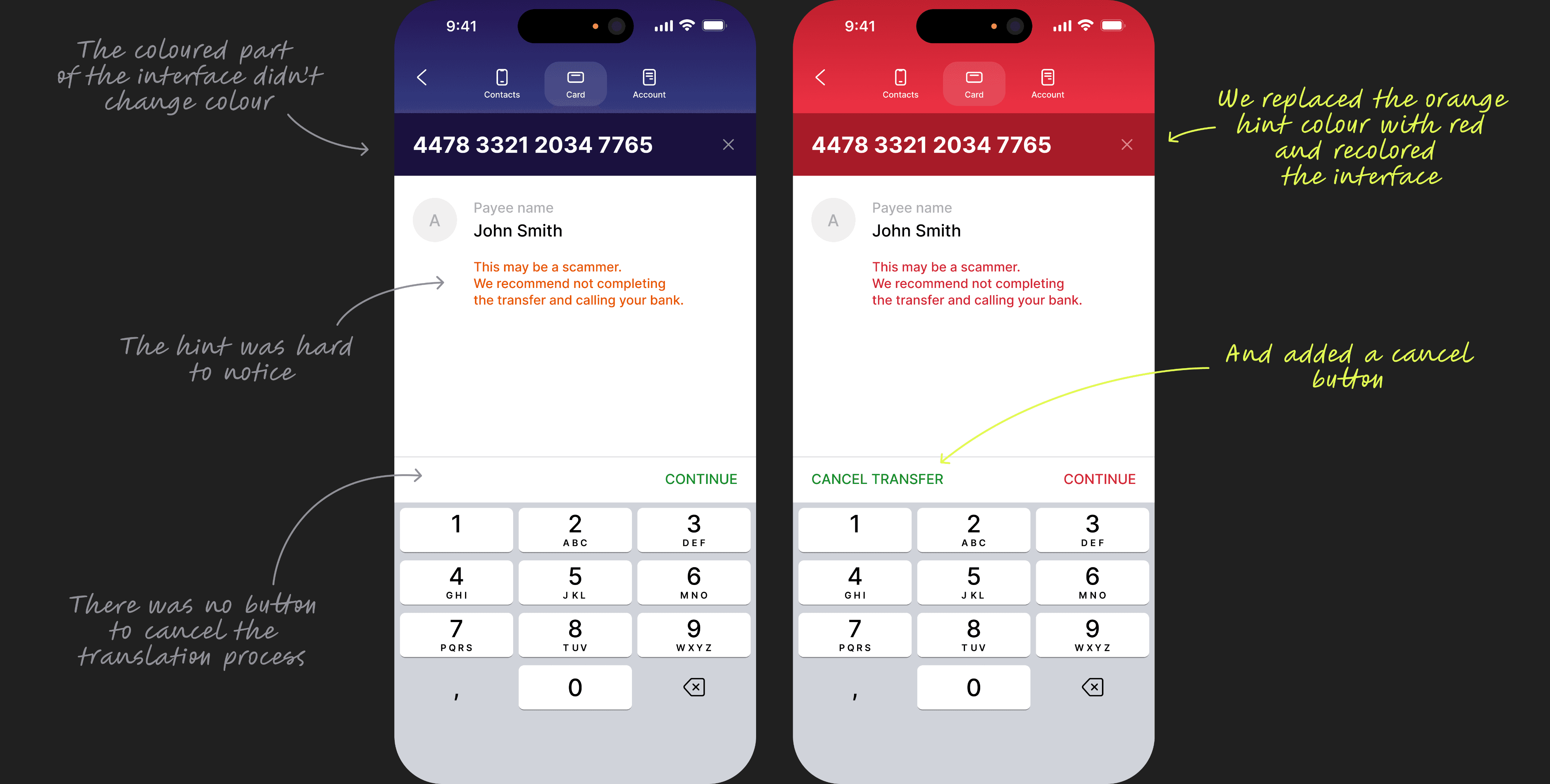
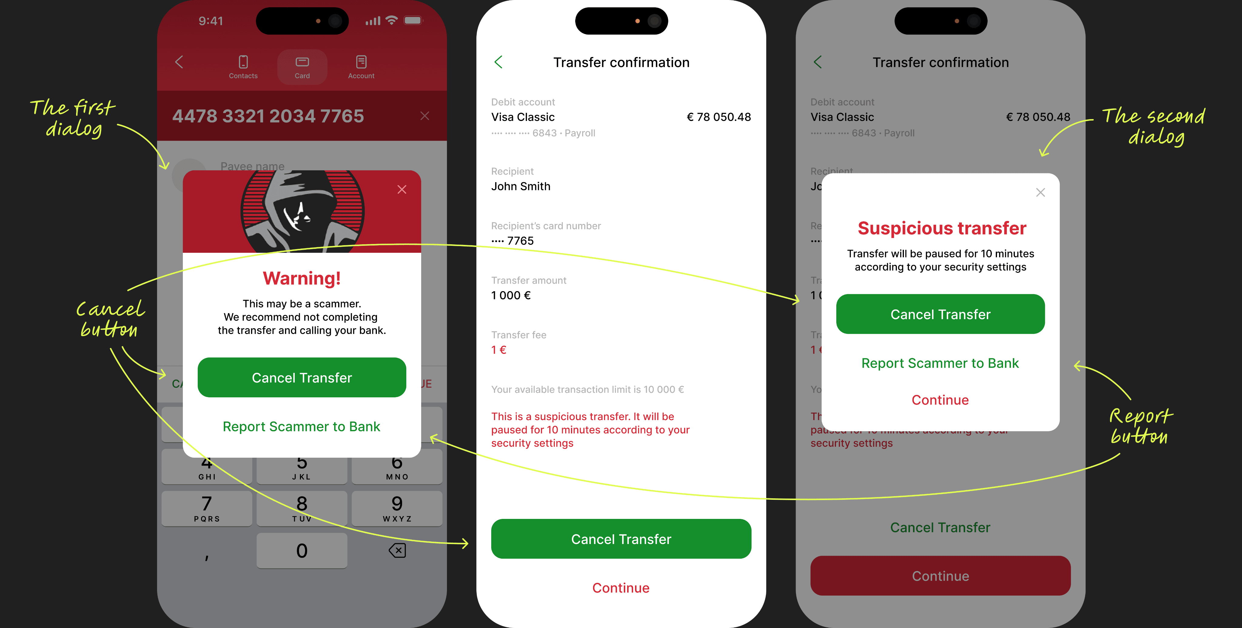
In the first iteration, we added a warning to the interface at every step of the transfer process — when entering the account number, the amount, and at the confirmation stage.
However, testing showed that people mostly ignored these warnings.
Even more surprising — many participants didn’t even notice that the button changed colour from green to orange!
Those who did notice the warning tried to quickly exit the screen and stop the transfer process.
They were actively looking for a “Cancel Transfer” button — they expected to see something clearly labeled like that, so they could be sure everything would stop immediately when pressed.

The screen with the message about the paused transfer also didn’t perform well.
Links to scam-related articles were seen by respondents as "stories" and immediately drew all their attention away from the main message — that the transfer had been paused.
The banner about the paused transfer on the home screen was noticed by everyone, but the fact that it redirected users back to the paused transfer screen increased the interaction cost — they had to switch screens and try not to get distracted by the “stories” again.
Final Deliverable
During testing, we realised that our warnings were not clear or noticeable enough.
If a person didn’t notice them in a calm environment, the chances of noticing them while under stress are even lower.
That’s why we decided to make the following changes:
Replaced the orange colour with red to increase the urgency of the interface and create stronger contrast with its normal state
Added a “Cancel Transfer” button so the user can stop the process at any time quickly and easily
Introduced a pop-up dialog with a scary image in the middle of the transfer process to intentionally interrupt the flow and snap the user out of it
Added a confirmation dialog before completing the transfer to interrupt the user once again and draw their attention
Made the “Cancel Transfer” button more noticeable and clearly visible
We also:
Redesigned the final screen, leaving only the message about the paused transfer and a single CTA button — Cancel Transfer
Updated the banner about the paused transfer: now the user can cancel the transfer with just one click, even directly from the app’s home screen
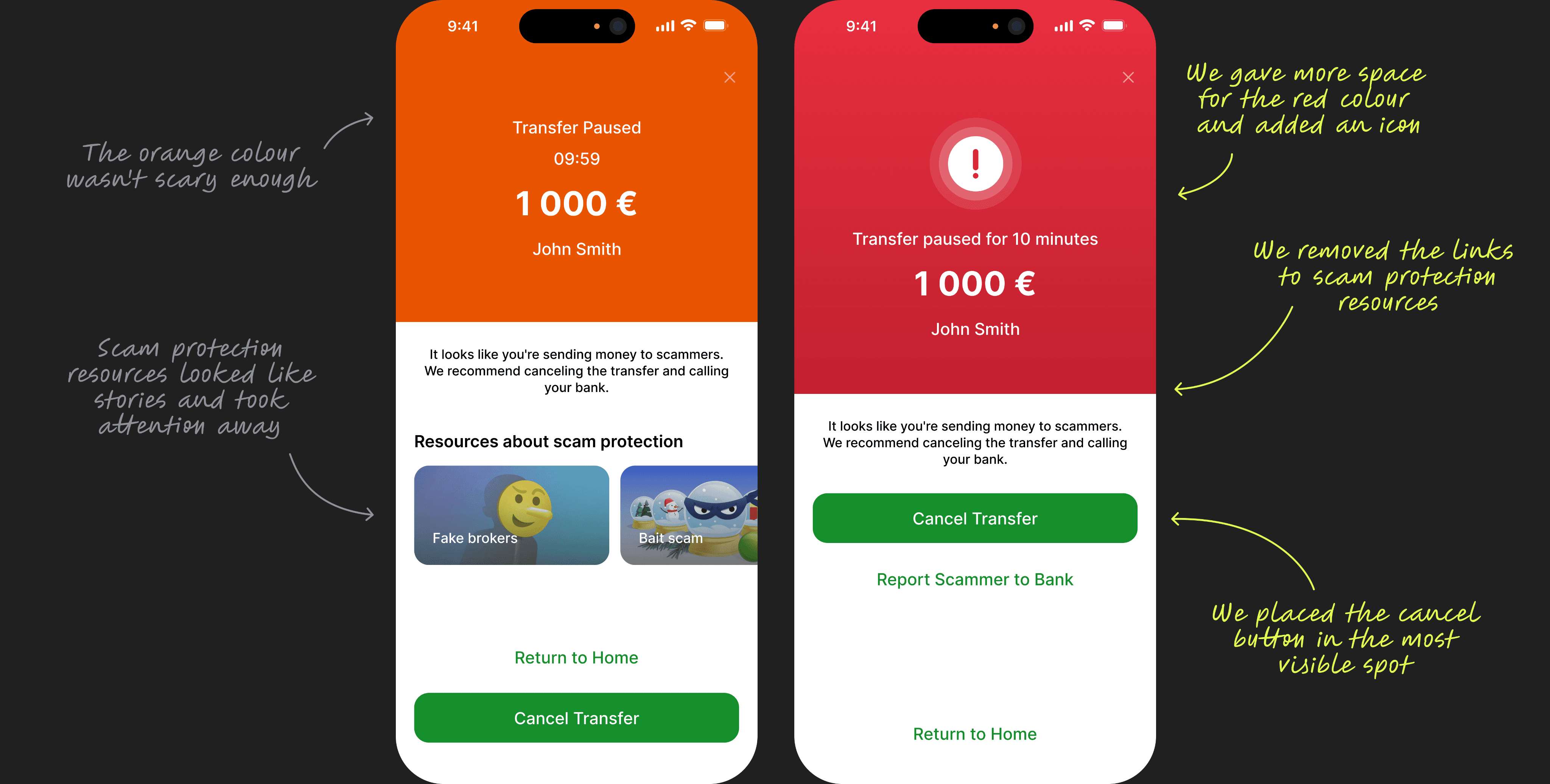

The final version showed excellent results — all respondents noticed that the interface was trying to warn them, understood what was happening, and knew how to stop or cancel the transfer at each step of the process.
Extra features
While working on the solution, I realised it still has some weak points.
For example, the user might tell the scammer that the transfer was paused, and the scammer could keep them engaged during the whole pause period. Scammers could also come up with new tricks to bypass the feature — like asking the person to change their security settings and disable the suspicious transfer pause before sending the money.
Of course, our solution makes scams more difficult to carry out, but the risk of becoming a victim still remains.
So we came up with a few more ideas and features that can work on their own or together to significantly lower the risk of phone fraud:

Takeaway & Reflection
This was a truly interesting and emotional project — one that proves design isn't just about crafting interfaces or moving pixels around in Figma.
I’d love to share some of the most insightful things I learned along the way:
When solving product challenges, your broader knowledge matters a lot. In this case, my background in psychology, forensic psychiatry, criminology, law — and even AI — turned out to be surprisingly helpful.
Sometimes research has to be done in stages, where each phase depends on the insights from the previous one.
Empathy is crucial in design — especially when the product touches on sensitive topics.
A good product solution isn’t always (or only) about the interface — it's about how smartly the product fits into the real-life context.
It's incredibly important to spot the flaws in your own solution — that's how you improve it.
Dark patterns can be used for good. In this case, modal windows and attention-grabbing buttons that disrupt the flow actually helped snap the user out of the scammer’s spell.
An emotional interface doesn’t always mean friendly or joyful. Sometimes, like here, scaring the user a little can actually save them.
The product was made for a bank with a green brand colour — and I can't help but wonder:
what if it had been a red one instead? 😄