
Backend-Driven UI that’s 6× faster to develop
MY Role
Product Design Lead
TEAM
Product Design Team
Frontend Developer Team
stakeholder
FinOps department at VK Tech, a large IT-company
Description
Project focused on developing a backend-driven UI to speed up layout implementation in design and front-end development, while reducing the number of mistakes during design-to-code handoff
KEY Results
6× faster development
Reduced development costs
Standardised user experience for more than 10 B2B digital products

Context
VK Tech is a large IT company that develops digital B2B products.
FinOps is a department within VK Tech that focuses on financial and operational platforms. In many FinOps products, users work with entities such as risks, requests, control procedures, documents, and more. Entity interfaces account for over 60% of all product interfaces.

Each of these entities has its own interface, allowing users to view the details and perform different actions with it.
Building each interface for every entity from scratch, first, takes a lot of time and resources on both the design and front-end sides. Second, it’s a repetitive task that often leads to small mistakes and inconsistencies when handing off the design to development.
Main Hypothesis
If we systematise the interfaces of all entities across different products, we can create a standard interface with an API (backend-driven UI) that will significantly speed up layout implementation in both design and front-end development — Entity Card Interface.
Research
I analysed more than 15 types of entities, along with their user stories, use cases, and user flows, and found that they have much more in common than different. I realised that if we take the 5 most diverse entities and break them down into parameters, we get a set that covers over 90% of any other entity in the system — whether it already exists or not.
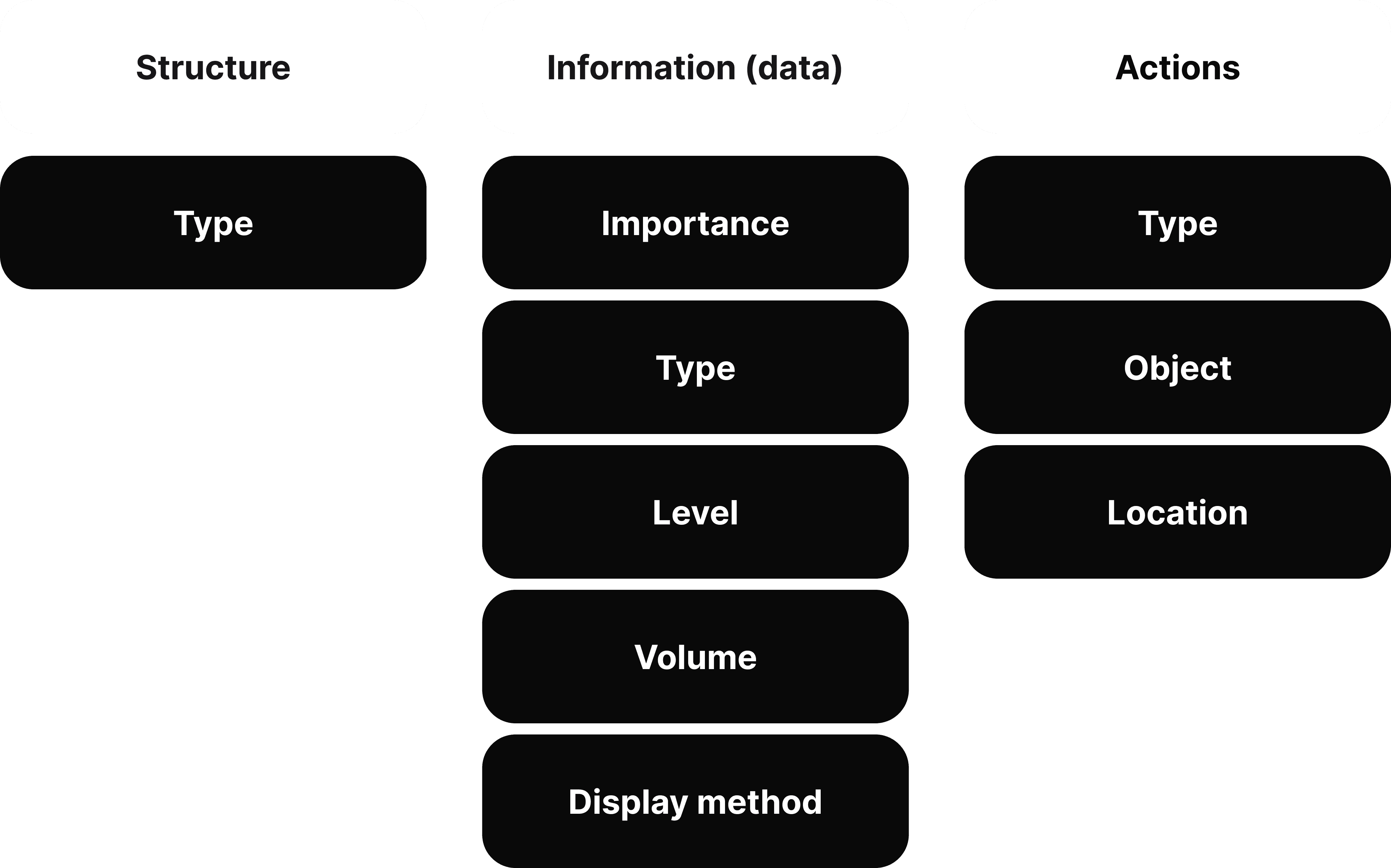
During the analysis and structuring process, I identified all the information that affects interface design and grouped it into three main categories:
characteristics of the entity’s structure,
information about the entity and its data,
actions related to the entity.
Within these categories, the information was further divided into subgroups.
As a result, there are four levels of detail, but for the purposes of this case, I’ll only present the basis for how the first two grouping levels were defined
The next step was to design a unified interface where all entity’s parameters would fit and remain flexible to support different variations of each one.
Designing the Universal UI
Screen Architecture
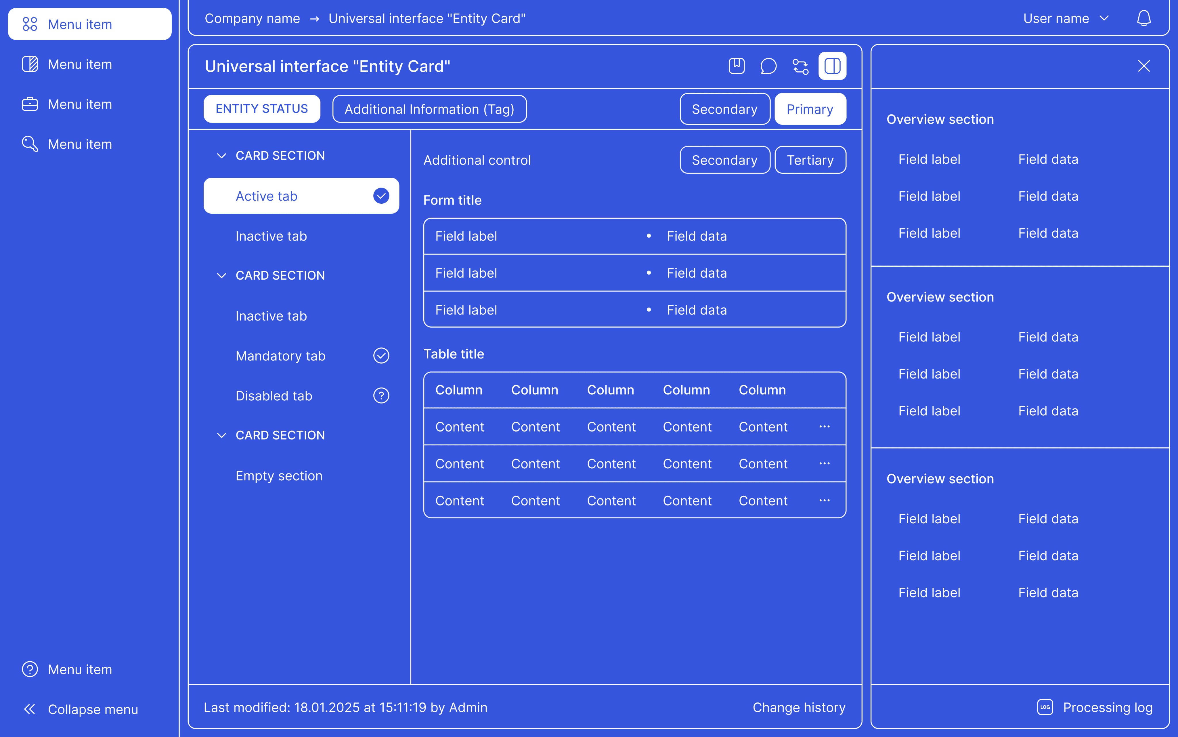
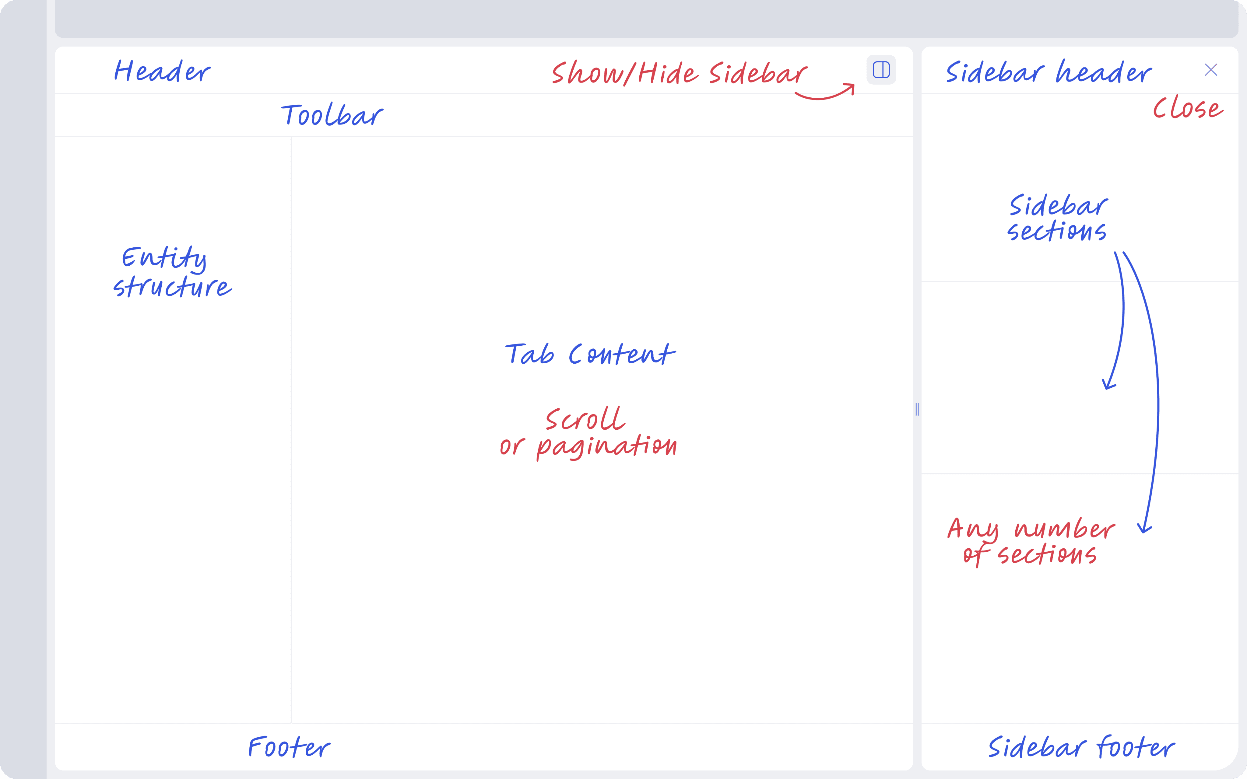
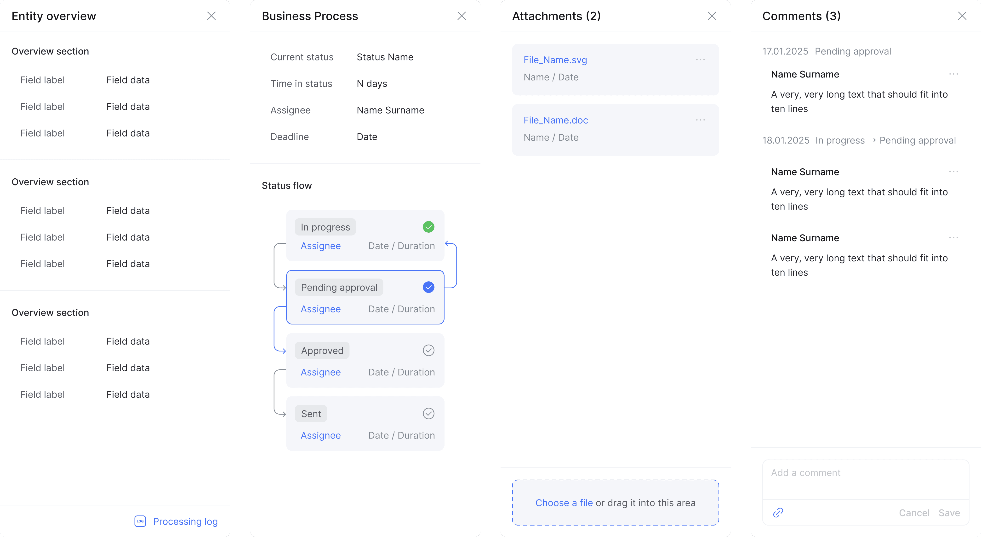
I divided the screen of the universal entity card interface into two parts to display different types of information based on their type and level of importance.
Main Page, which includes:
Header — individualising and high-level information
Toolbar — entity-level information and actions
Entity Structure — the structure of the entity
Tab Content — content of the entity section; the main content
Footer — technical information
Sidebar, which includes:
Sidebar Header — title of the sidebar
Sidebar Sections — sections of the sidebar, additional content
Sidebar Footer — secondary technical information
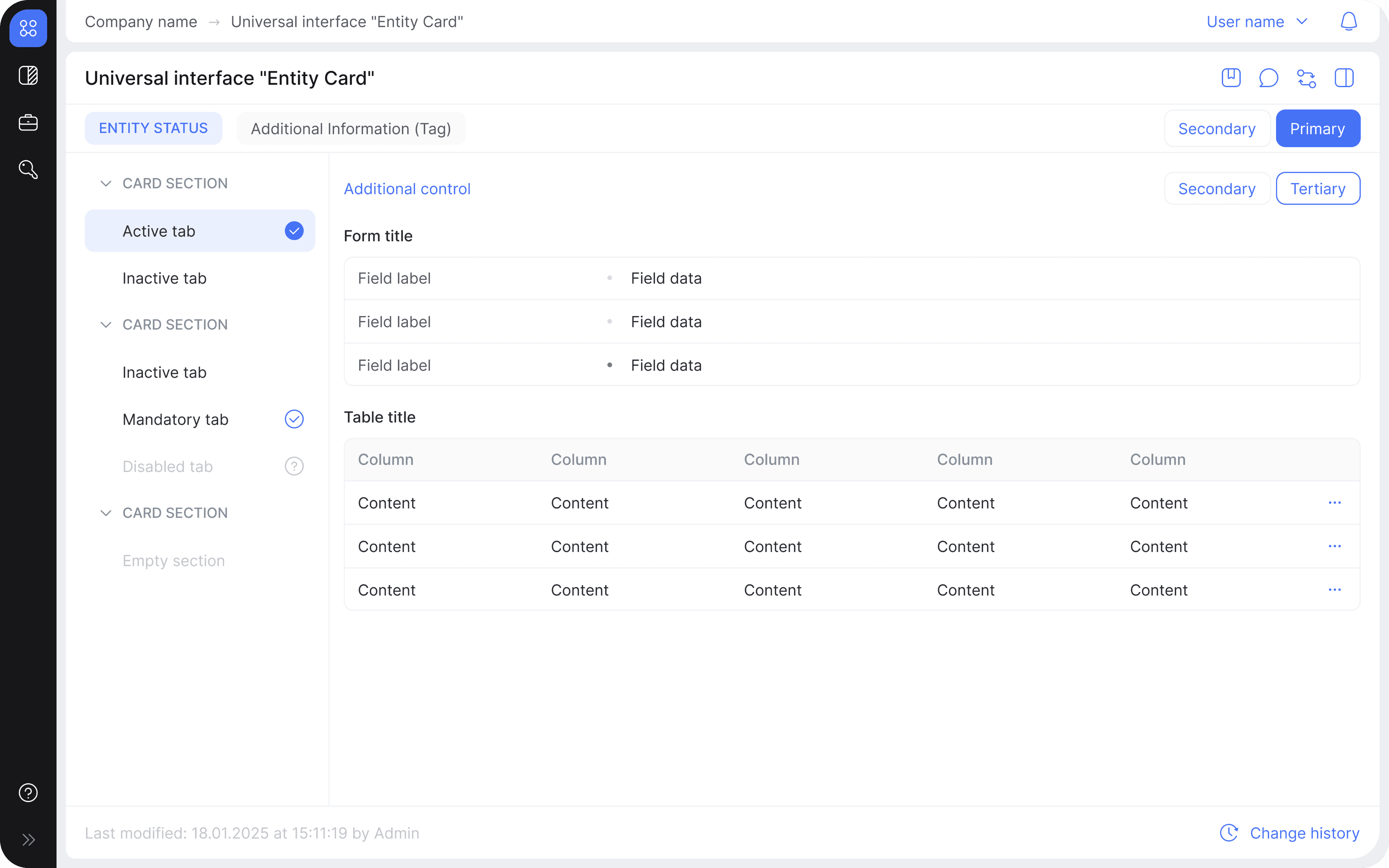
Header & Toolbar
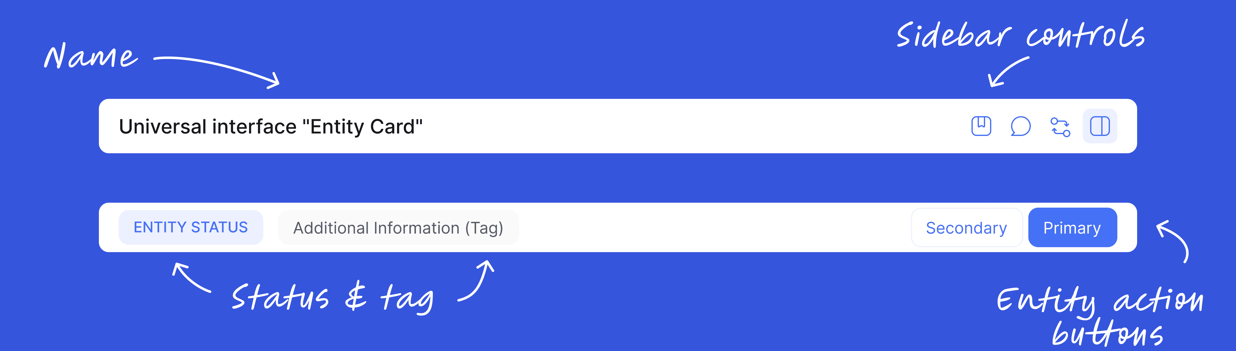
Each entity always has a name, which is usually how a person identifies it — the name is displayed on the left side of the entity card header. On the right side of the header are the controls for managing the sidebar.
An entity usually also has a status and an additional identifier (a tag) — both are shown on the left side of the entity card toolbar. On the right side of the toolbar are the action buttons for working with the entity.
Entity structure
Entities can be either simple (with a single tab) or complex (with multiple tabs that can be grouped in different ways). To allow the interface to support any structure, we reserved space on the left side of the entity card for a customisable hierarchy — entity structure:
If the entity is simple, there is no hierarchy at all
If the entity is complex but not hierarchical, all elements in the hierarchy are on the first level
If the entity is both complex and hierarchical, the hierarchy includes grouped levels
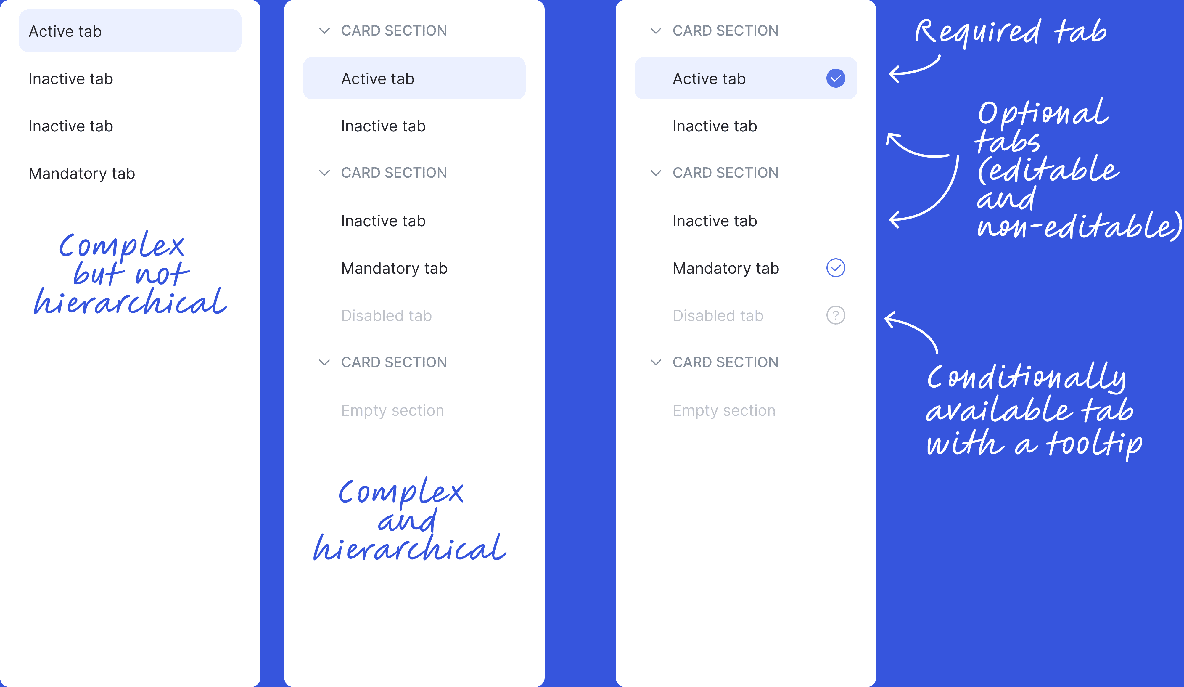
Entity tabs can have different editing types:
Non-editable — meant for viewing information only
Editable but optional — can be edited if the user chooses to
Editable and required — must be edited to complete the task
Unavailable for editing or viewing — hidden until the user does something, like filling another tab
In addition, to display various extra information and perform certain actions with the entity, I added a sidebar. It can be opened or closed, and in some cases, it may be completely hidden.
Entity Sections (Tabs)
Tabs can vary a lot, but I found that they usually serve one of the following purposes:
Showing information about a single object or section — single form
Showing information about multiple objects or sections — multiple forms and/or a table
Performing actions (including extra actions in modals) — multiple buttons and controls
Adding objects, data, or files — multiple buttons and controls
Since a tab can contain a lot of information, some interface elements may be hidden inside collapsible sections.

I approached the systematisation of business actions not from the perspective of their business meaning, but by looking at the type of action, which part of the entity it relates to, and where in the interface it takes place.
This approach allowed us to include all the necessary controls and their combinations in the entity card interface.
Then, I prioritised all actions relative to each other and, based on factors like importance and frequency of use, defined where each action should appear in the entity card interface.
Sidebar
I paid special attention to standard actions that run in parallel to working with the entity and have their own business meaning and even their own step-by-step flow — like commenting or attaching files.
It’s clear that these actions need a dedicated space in the interface, but placing them inside the entity’s structure wouldn’t make sense. That’s why I decided to use the sidebar for them, adding the ability to switch its content — depending on the mode, the sidebar shows different content.
Universal Interface
As a result, I created a universal entity card interface that allows us to display any type of entity across all our products in a consistent and predictable way:
Unfortunately, due to tight deadlines, I didn’t have the chance to run user testing before developing the universal interface. Instead, I used mockups to make sure that a wide range of entity types and use cases fit well into the structure, and then moved on to building the API.
The universal interface API is designed in a way that allows full flexibility — the entity card can be customised by simply enabling or disabling different parameters, essentially allowing the interface to be drawn directly from the backend (backend-driven UI).
First Impressive Results
Right after development, we used the universal entity card interface to build screens for a new feature — in order to meet a very tight deadline for one of the projects.
Thanks to the entity card interface, we achieved an incredible development speed:
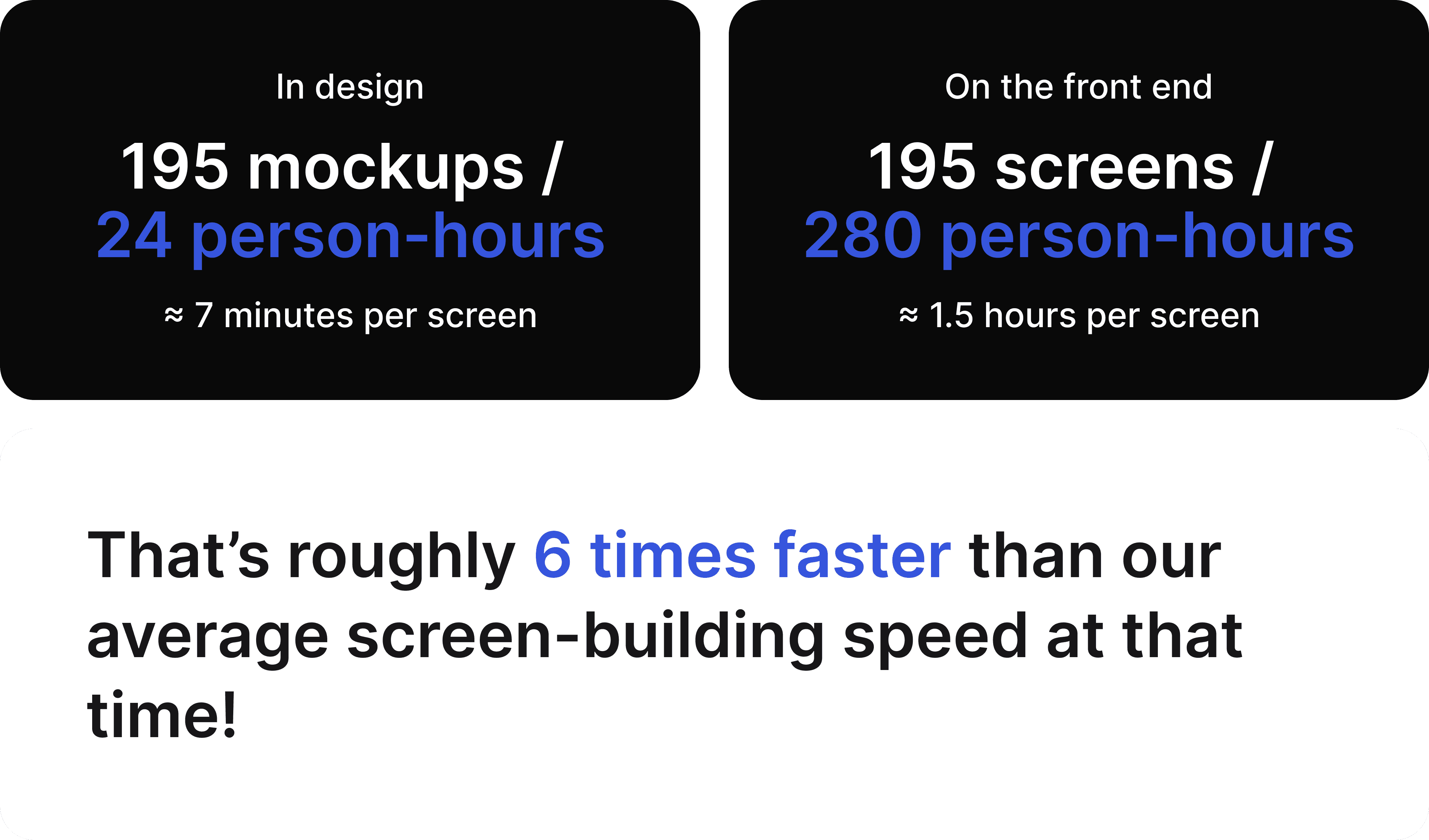
Additionally, we significantly reduced the number of mistakes during design handoff to the frontend and eliminated the need for design reviews.
For a typical interface, it's enough to define and verify all UI parameters (such as spacing, border radius, sizes, etc.) once — after that, they can be reused consistently and without mistakes.
User Testing & Continued Application
We continue to actively use the universal entity card interface as a fully integrated template-level component of our design system to ensure high development speed and a consistent user experience.
In addition to the API documentation, we created extensive internal documentation that describes the entity card as a UX/UI pattern and shared it with the entire team. This shared documentation helps us stay aligned, keep all current knowledge about the interface in one place, and store our ideas for future improvements.
We also have a development plan for the interface — we’re aware that it’s not perfect and we know what our next steps should be to make it better.
In addition, we’ve conducted user testing and identified some usability issues that we plan to address in the near future.
Takeaway & Reflection
This is one of my favourite projects because it clearly shows the power of the things I deeply believe in:
Formal logic, as well as systems and analytical thinking, are essential in design
When a designer and a front-end developer are aligned and work toward the same goal, real magic can happen at the point where they meet
Reusing template-level components from a design system is incredibly effective and brings amazing speed
Documenting components and UX/UI patterns is a necessary and very valuable part of the development process
But the most important thing — this project gave me a completely new perspective on design!